Whether you’re simply considering a new design or you haven’t been getting much traffic lately, it may be time to improve the design of your company’s website. There are some simple things that you can do to quickly and easily improve the design. This not only adds a new look to the site, it also can help improve your traffic and even your conversion rates.
Branding and Logo

Branding and Logo
Image via Flickr by Seth W.
Is your logo recognizable? Do you have consistent branding throughout your entire website? Both of these are crucial. If your brand isn’t recognizable, people aren’t going to remember it in the future. Consider bringing a consistent theme through your website, and ensuring that you have a unique logo.
Declutter the Pages
Take a look at your homepage. Does it seem like a mish-mash of information? Consider doing a bit of spring cleaning on your site. This could involve getting rid of unneeded images. Or, you might need to cut down on some of the text on the page. No matter what you get rid of, remember it’s for a good reason. Once you’re done with the homepage, move on to other pages on the site. Clean pages help people focus on what they’re there to do.
Reconsider Your Call to Action

Reconsider Your Call to Action
Image via Flickr by Sean MacEntee
Have you looked at your call to action recently? Is it something that truly calls to your users? What are you trying to get them to do? One mistake that many businesses make is that their call to action is confusing. They use misleading or contradictory call to actions throughout their sites.
Make your site better by simply making sure that it portrays the same message throughout. Even the style of the call to action can be changed. If you currently have it simply as text, you could change this to a button, or vise-versa.
Check out Your Navigation
Take a look at your navigation. Maybe it’s time to try a new style. Have you had your website navigation across the top of the site? Consider using a sidebar in its place. Instead of having all the categories and subcategories listed out at once, try flyaways. This can save you room on the design, and it can also change things up enough to entice new visitors. Make the navigation area larger or smaller to further change the design.
Change the Colors

Change the Colors
Image via Flickr by ceslava.com
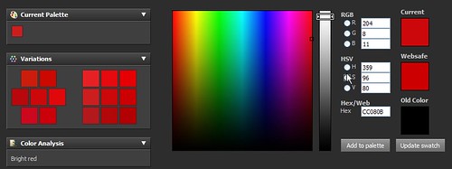
One of the simplest things you can do to change the look of your website is to change the colors. This can make the whole website look completely different, while at the same time leaving it fundamentally the same. Try playing around with a few different color schemes. It’s generally understood that you should stick with two to four colors. More than this, and the design gets confusing and complicated. It’s also a good idea to keep the colors complementary to ensure the design looks its best.
If you aren’t comfortable making design changes to your website, consider working with a design company such as B² Interactive. You can get great design options when working with a design company.
